Clear data visualisations are key to making an impact on your audience. Regardless of the type of visualization you use or the technology you use to prepare it, the following tips will help you refine your visualization and increase the chances of your audience understanding the story you're telling.
Clutter is bad. Simple is good
Don’t let non-essential visualisation elements detract from your message. Embrace your inner Marie Kondo – if it doesn’t ‘spark joy’, it must go! Think about the following, which might help you deliver your message with clarity:
- grid lines make it easier for readers to understand key values. You likely won’t need major and minor grid lines for both your horizontal and vertical axis
- data labels may help you to do away with grid lines all together
- do you need axis labels? Sometimes a well composed chart title can contain all required information.
- legends are helpful when you have more than one variable. If you are charting one variable, try removing the legend and adding this information to the chart title.
Remove anything that doesn’t add to your story. If in doubt, experiment with turning off various visualisation features. You can always turn them back on if you change your mind (nobody will ever know).
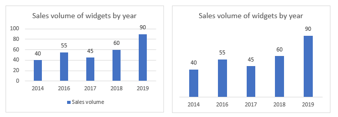
The above graphics show how it is possible to improve the readability of a visualisation simply by removing unnecessary features.
Keep it minimal
It can be fun picking a swatch of pretty colours to make your visualisation pop out from the screen, but lots of colour can isn’t just distracting, it can distract from your intended message. Consider the following when choosing a colour scheme:
- the human eye can only detect around four different shades of the same colour
- around eight per cent of males have some form of colour blindness
- your graph will inevitably be printed in black and white at some point
- graduated shading adds nothing to a visualisation (and will make you look silly)
- what is the purpose of a background colour? If using a darker background (i.e. for dashboards), a light neutral shade of grey usually renders better on screen than plain white.
And while we’re talking colour, red should only be used to accentuate a specific point. If you include too much red, your reader won’t know where to look. But a little splash can be effective.
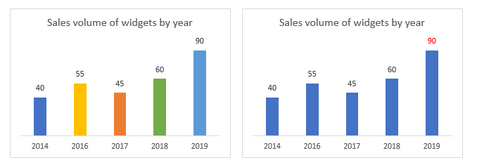
The colours on the visualisation don’t add anything to the story. By simplifying the colour scheme and using red to accentuate the increase in sales of widgets in 2019 the reader can focus on the story being told.
Alignment matters – horizontal is always best
Visualisation real estate can be annoyingly limited. When you are trying to fit that last widget into your dashboard it can be tempting to use all variations of text size and alignment to squeeze it in. Diagonal text alignment looks terrible and is almost always harder to read that horizontally aligned text. Just don’t do it. Honestly.
If you are struggling to fit a label, consider how the text could be shortened or other features you can remove.
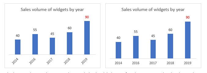
By simply changing the text alignment to horizonal, the data labels are infinitely easier to read and understand.
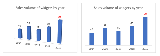
Three dimensional nightmares
3D graphs are awful when the data does not support it. If it can accurately be presented in 2D form, do it in 2D. And if you need the third dimension, use it wisely.
This is the second part of a blog series on visualising data. In part one, we explored how to best prepare for visualisations. The next blog will explore story telling with data.